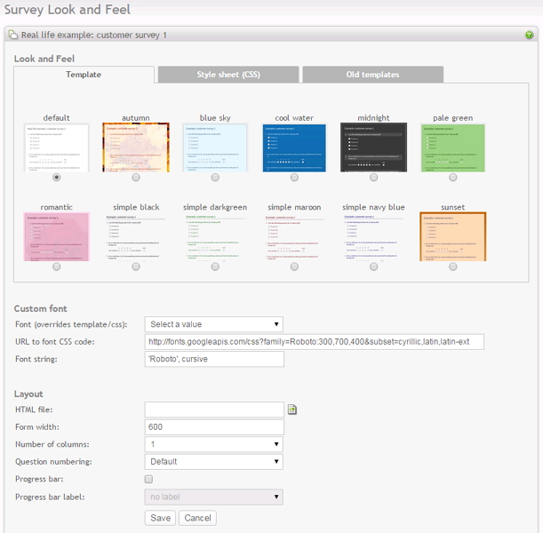
The survey look and feel is important for several reasons. It sends a message to the respondent that the survey is "serious" or "professional" or simply for fun. It is sometimes important to match the design of your website.

The design of your survey can be controlled by two main methods. A survey template, or a CSS file (Cascading Style Sheet). The simplest is to use a template, which is often more complete, with a set of images, to enhance the look & feel.
- Template: To use s template, click on the template-tab. A template is a predefined look and feel that you can choose for your survey. Select a template, and click on save. Click on preview survey in the menu box to see how your survey looks with this new design. Currently, a template can not be uploaded or changed through the Opinio user interface.
-
CSS: To use s CSS file, click on the CSS-tab. A CSS file is a style sheet file that controls the look and feel of your survey. CSS files are very helpful if you need to make your own customized look & feel, by editing the settings in these files. Every element on the survey page can be customized by the CSS file. It requires some basic CSS insight to be able to do this. The CSS files included with Opinio has many comments in it that explains what areas of the survey page can be customized. There are plenty of guides on the internet. A couple of examples:
The CSS file can be edited directly in Opinio, or by any editor that supports CSS. The basic requirement of such an editor is that it saves the content as plain text (do not use editors like MS Word). See Reusable resources for details on how to upload/download/update CSS files.
- Font (overrides template/css): Font selection. This list lets you select from a set of predefined custom fonts. Selecting an item in this list fills out the two fields below (URL and font string). What is currently selected in this list is not important - it is the values in the two fields below that defines the custom font setting.
-
URL to font CSS code: It is useful to use your own font sometimes when creating your survey. If for example you are creating a survey in a language that has a different character set than what the default font does not support, you might have to use a different font. Or perhaps you just want to have a different look and feel on your survey form. When using a custom font, it is possible (but not required) to specify the URL to the CSS code that defines the custom font. You can write your own custom CSS and put this on a server and then put the URL to it here. However, writing this code yourself is not recommended, since it is a bit complicated and error prone. The difficulty here is to write the CSS code that works across browsers. We highly recommend that you use a service like Google Fonts. Google has done all the hard work for you. And it has a great selection of around 1000 different fonts at the time this is written. When using a Google font, make sure you only select a single font from their collection, because you can only use a single font in Opinio for this (unless you have created a custom template that uses more than one font). Selecting more than one will result in more data to download for each survey respondent. You can find Google Fonts here: https://www.google.com/fonts
Example 13. Example
http://fonts.googleapis.com/css?family=Signika:300,400,600&subset=latin,latin-ext
Make sure you include at least the font weights 400 and 600 when you add the font to your collection. This will allow the themes in Opinio to set boldness correctly. Add 300 also, if available in the font you like, since it is used by some themes.
-
Font string: If you are using a custom font, this field is required. It may need a URL to the actual fonts. It depends. If for example you want to use a common font that is provided by virtually all browsers, you can type in the string "arial" - it will not require a URL. The same goes for other common fonts like "verdana", "curier new" and a few others. The browsers will already have these font available. If you are using a truly custom font not usually available in browsers, you have to specify a URL pointing to the CSS code that defines the font. The CSS code then defines what string must be used here. At the minimum, specify the name of the font in quotes. It is also recommended that you add the generic name for this type of font, so that the browser can default to another similar font if the custom font can not be downloaded and used for some reason.
- HTML file: It is optional to use an HTML file. This is needed when you need more control of the survey page, for example if you need to add a left menu or other items to the page. An HTML file provides a way to insert all the survey content inside an HTML document. A HTML file must include the tag <survey> where the survey will be inserted. If you want to use the survey style sheet (CSS), you must include the CSS reference in the template file. See an HTML guide for how to include a reference to a CSS file (beyond the scope of this guide).
- Form width: The width of your survey in pixels.
-
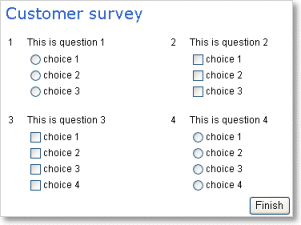
Number of columns: Allows for displaying questions in more than one column. The default is one column (question 2 below question 1, etc). More than one column saves screen area and vertical scrolling. Make sure your questions aren't too wide, because that will push the columns to right of the question further to the right. The maximum number of columns is 3. Example with 2 columns:

- Question numbering: “default” uses standard numbering, e.g. 1-2-3-4 etc. For displaying other numbers that 1,2,3.., enable custom numbering by selecting it here. To configure what is actually displayed, see the section called “Custom question numbers”
-
Progress bar: Shows the progress of the survey. The bar show the progress on the question it is located, before you answer the question. E.g. If you are located on question one out of four, the progress bar will show 25%.
Progress bar label will be shown to the right of the bar.
- select “percent label” to show percent completed (i.e. 25%).
- select “count label” to show number of completed questions out of total (i.e. 1/4).
If you use Branch conditions in the survey, the progress bar will still count in the skipped questions. In a large survey this will not really be noticeable, but if you only have a few questions we recommend not using the progress bar. NOTE: The Progress bar is not useful if you have all the questions on one page.